There’s a whole paper by Hadley Wickham about tidy data but it’s in a PDF so you’re probably not going to read it. Here’s the paper’s definition of tidy data:
Each variable forms a column.
Each observation forms a row.
Each type of observational unit forms a table.
As Dr Wickham notes, this is Codd’s 3rd Normal Form but in statspeak rather than databasespeak.
The meaning of “variable” and “observation” depend on what we’re studying, so tidy data is a concept that you mostly learn through experience and ✨vibes✨.
Now we’ll explore what tidy data looks like for an NBA results dataset.
Get the data
from pathlib import Path
import polars as pl
import pandas as pd
pl.Config.set_tbl_rows(5 )
pd.options.display.max_rows = 5
nba_dir = Path("../data/nba/" )
column_names = {
"Date" : "date" ,
"Visitor/Neutral" : "away_team" ,
"PTS" : "away_points" ,
"Home/Neutral" : "home_team" ,
"PTS.1" : "home_points" ,
}
if not nba_dir.exists():
nba_dir.mkdir()
for month in (
"october" ,
"november" ,
"december" ,
"january" ,
"february" ,
"march" ,
"april" ,
"may" ,
"june" ,
):
# In practice we would do more data cleaning here, and save to parquet not CSV.
# But we save messy data here so we can clean it later for pedagogical purposes.
url = f"http://www.basketball-reference.com/leagues/NBA_2016_games- { month} .html"
tables = pd.read_html(url)
raw = (
pl.from_pandas(tables[0 ].query("Date != 'Playoffs'" ))
.rename(column_names)
.select(column_names.values())
)
raw.write_csv(nba_dir / f" { month} .csv" )
nba_glob = nba_dir / "*.csv"
pl.scan_csv(nba_glob).head().collect()
shape: (5, 5) date away_team away_points home_team home_points str str i64 str i64 "Fri, Apr 1, 20… "Philadelphia 7… 91 "Charlotte Horn… 100 "Fri, Apr 1, 20… "Dallas Maveric… 98 "Detroit Piston… 89 "Fri, Apr 1, 20… "Brooklyn Nets" 91 "New York Knick… 105 "Fri, Apr 1, 20… "Cleveland Cava… 110 "Atlanta Hawks" 108 "Fri, Apr 1, 20… "Toronto Raptor… 99 "Memphis Grizzl… 95
Cleaning đź§ą
Nothing super interesting here:
games_pl = (
pl.scan_csv(nba_glob)
.with_columns(
pl.col("date" ).str .strptime(pl.Date, "%a, %b %d , %Y" ),
)
.sort("date" )
.with_row_count("game_id" )
)
games_pl.head().collect()
shape: (5, 6) game_id date away_team away_points home_team home_points u32 date str i64 str i64 0 2015-10-27 "Cleveland Cava… 95 "Chicago Bulls" 97 1 2015-10-27 "Detroit Piston… 106 "Atlanta Hawks" 94 2 2015-10-27 "New Orleans Pe… 95 "Golden State W… 111 3 2015-10-28 "Washington Wiz… 88 "Orlando Magic" 87 4 2015-10-28 "Philadelphia 7… 95 "Boston Celtics… 112
games_pd = (
pl.read_csv(nba_glob)
.to_pandas()
.dropna(how= "all" )
.assign(date= lambda x: pd.to_datetime(x["date" ], format = "%a, %b %d , %Y" ))
.sort_values("date" )
.reset_index(drop= True )
.set_index("date" , append= True )
.rename_axis(["game_id" , "date" ])
.sort_index()
)
games_pd.head()
away_team
away_points
home_team
home_points
game_id
date
0
2015-10-27
Cleveland Cavaliers
95
Chicago Bulls
97
1
2015-10-27
Detroit Pistons
106
Atlanta Hawks
94
2
2015-10-27
New Orleans Pelicans
95
Golden State Warriors
111
3
2015-10-28
Philadelphia 76ers
95
Boston Celtics
112
4
2015-10-28
Washington Wizards
88
Orlando Magic
87
Polars does have a drop_nulls
method but the only parameter it takes is subset
, which — like in Pandas — lets you consider null values just for a subset of the columns. Pandas additionally lets you specify how="all"
to drop a row only if every value is null, but Polars drop_nulls
has no such parameter and will drop the row if any values are null. If you only want to drop when all values are null, the docs recommend .filter(~pl.all(pl.all().is_null()))
.
A previous version of the Polars example used pl.fold
, which is for fast horizontal operations. It doesn’t come up anywhere else in this book, so consider this your warning that it exists.
Pivot and Melt
I recently came across someone who was doing advanced quantitative research in Python but had never heard of the Pandas .pivot
method. I shudder to imagine the code he must have written in the absence of this knowledge, so here’s a simple explanation of pivot
ing and melt
ing, lest anyone else suffer in ignorance. If you already know what pivot and melt are, feel free to scroll past this bit.
Pivot
Suppose you have a dataframe that looks like this:
Code
from datetime import date
prices = pl.DataFrame({
"date" : [* [date(2020 , 1 , 1 )]* 4 , * [date(2020 , 1 , 2 )]* 4 , * [date(2020 , 1 , 3 )]* 4 ],
"ticker" : [* ["AAPL" , "TSLA" , "MSFT" , "NFLX" ]* 3 ],
"price" : [100 , 200 , 300 , 400 , 110 , 220 , 330 , 420 , 105 , 210 , 315 , 440 ],
})
prices
shape: (12, 3) date ticker price date str i64 2020-01-01 "AAPL" 100 2020-01-01 "TSLA" 200 … … … 2020-01-03 "MSFT" 315 2020-01-03 "NFLX" 440
In both Polars and Pandas you can call df.pivot(index="date", values="price", columns="ticker")
to get a dataframe that looks like this:
Code
pivoted = prices.pivot(index= "date" , values= "price" , columns= "ticker" )
pivoted
shape: (3, 5) date AAPL TSLA MSFT NFLX date i64 i64 i64 i64 2020-01-01 100 200 300 400 2020-01-02 110 220 330 420 2020-01-03 105 210 315 440
As you can see, .pivot
creates a dataframe where the columns are the unique labels from one column (“ticker”), alongside the index column (“date”). The values for the non-index columns are taken from the corresponding rows of the values
column (“price”).
If our dataframe had multiple prices for the same ticker on the same date, we would use the aggregate_fn
parameter of the .pivot
method, e.g.: prices.pivot(..., aggregate_fn="mean")
. Pivoting with an aggregate function gives us similar behaviour to what Excel calls “pivot tables”.
Melt
Melt is the inverse of pivot. While pivot takes us from long data to wide data, melt goes from wide to long. If we call .melt(id_vars="date", value_name="price")
on our pivoted dataframe we get our original dataframe back:
Code
pivoted.melt(id_vars= "date" , value_name= "price" )
shape: (12, 3) date variable price date str i64 2020-01-01 "AAPL" 100 2020-01-02 "AAPL" 110 … … … 2020-01-02 "NFLX" 420 2020-01-03 "NFLX" 440
Tidy NBA data
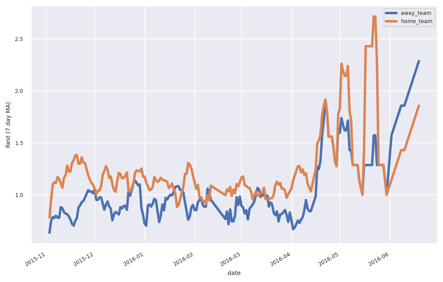
Suppose we want to calculate the days of rest each team had before each game. In the current structure this is difficult because we need to track both the home_team
and away_team
columns. We’ll use .melt
so that there’s a single team
column. This makes it easier to add a rest
column with the per-team rest days between games.
tidy_pl = (
games_pl
.melt(
id_vars= ["game_id" , "date" ],
value_vars= ["away_team" , "home_team" ],
value_name= "team" ,
)
.sort("game_id" )
.with_columns((
pl.col("date" )
.alias("rest" )
.diff().over("team" )
.dt.days() - 1 ).cast(pl.Int8))
.drop_nulls("rest" )
.collect()
)
tidy_pl
shape: (2_602, 5) game_id date variable team rest u32 date str str i8 5 2015-10-28 "away_team" "Chicago Bulls" 0 6 2015-10-28 "home_team" "Detroit Piston… 0 … … … … … 1315 2016-06-19 "away_team" "Cleveland Cava… 2 1315 2016-06-19 "home_team" "Golden State W… 2
tidy_pd = (
games_pd.reset_index()
.melt(
id_vars= ["game_id" , "date" ],
value_vars= ["away_team" , "home_team" ],
value_name= "team" ,
)
.sort_values("game_id" )
.assign(
rest= lambda df: (
df
.sort_values("date" )
.groupby("team" )
["date" ]
.diff()
.dt.days
.sub(1 )
)
)
.dropna(subset= ["rest" ])
.astype({"rest" : pd.Int8Dtype()})
)
tidy_pd
game_id
date
variable
team
rest
7
7
2015-10-28
away_team
New Orleans Pelicans
0
11
11
2015-10-28
away_team
Chicago Bulls
0
...
...
...
...
...
...
1315
1315
2016-06-19
away_team
Cleveland Cavaliers
2
2631
1315
2016-06-19
home_team
Golden State Warriors
2
2602 rows Ă— 5 columns
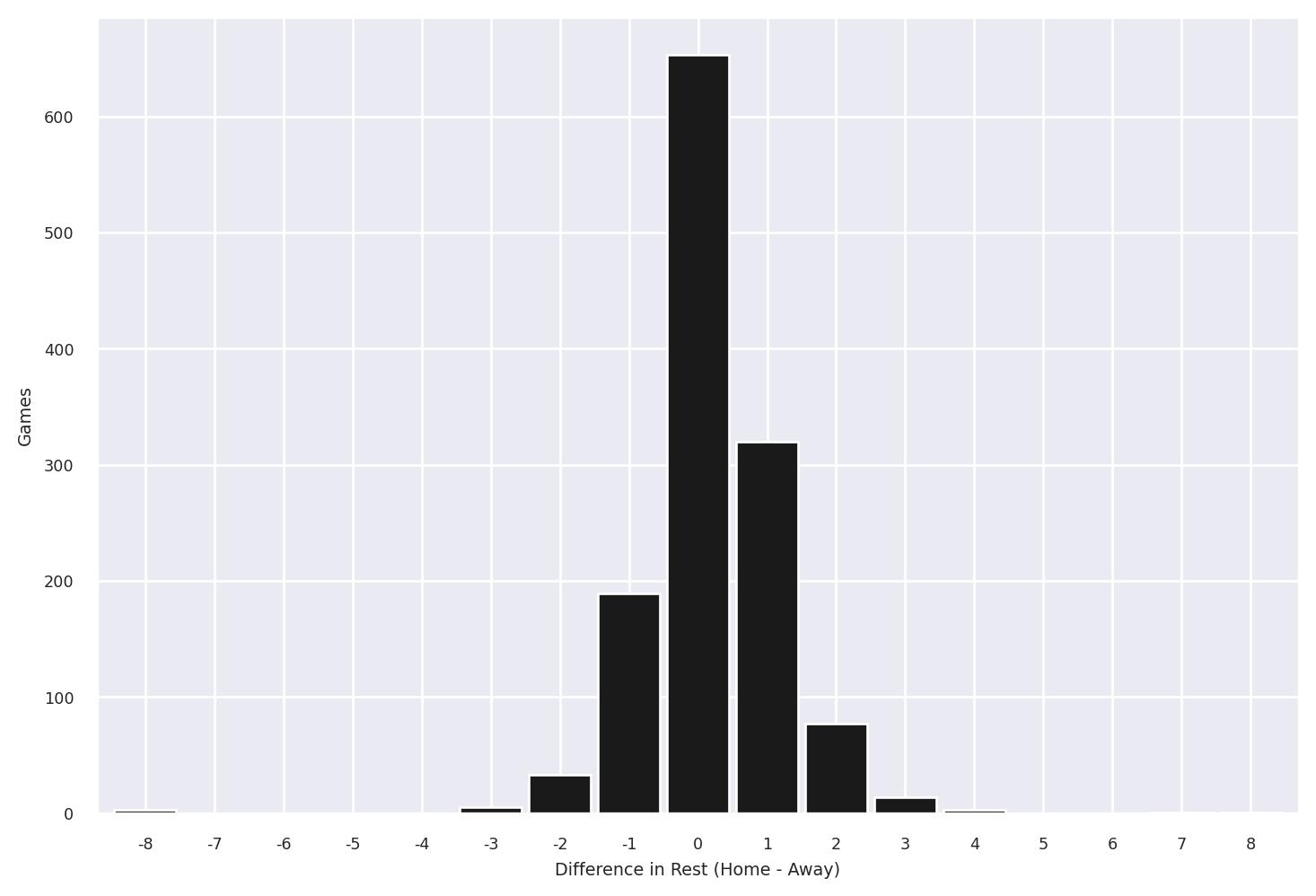
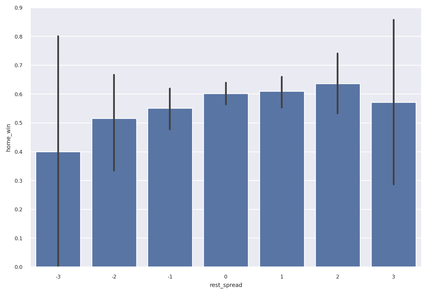
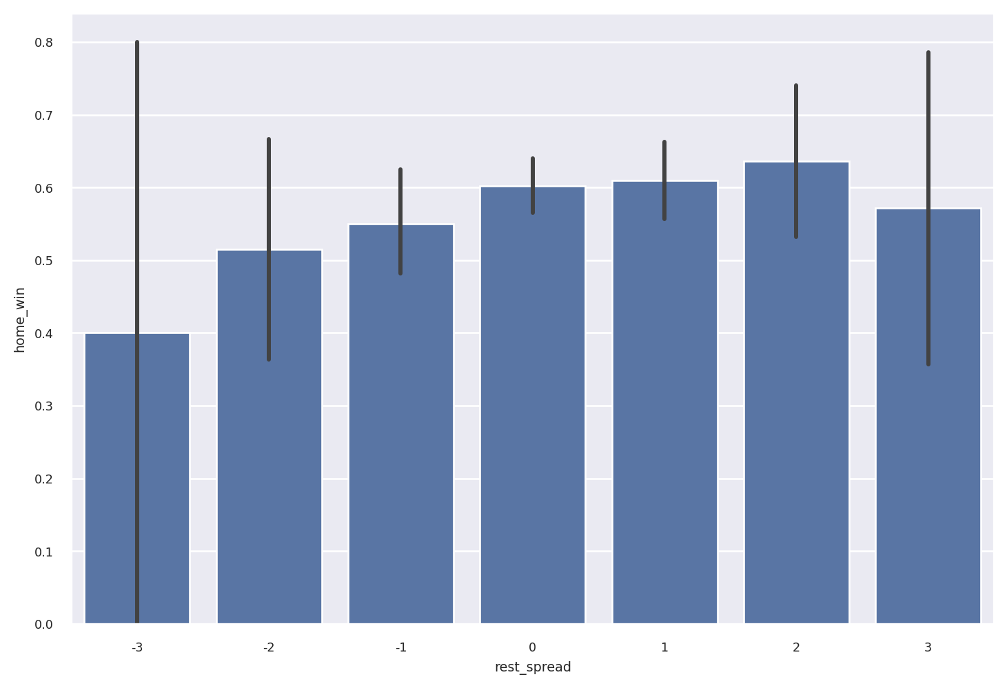
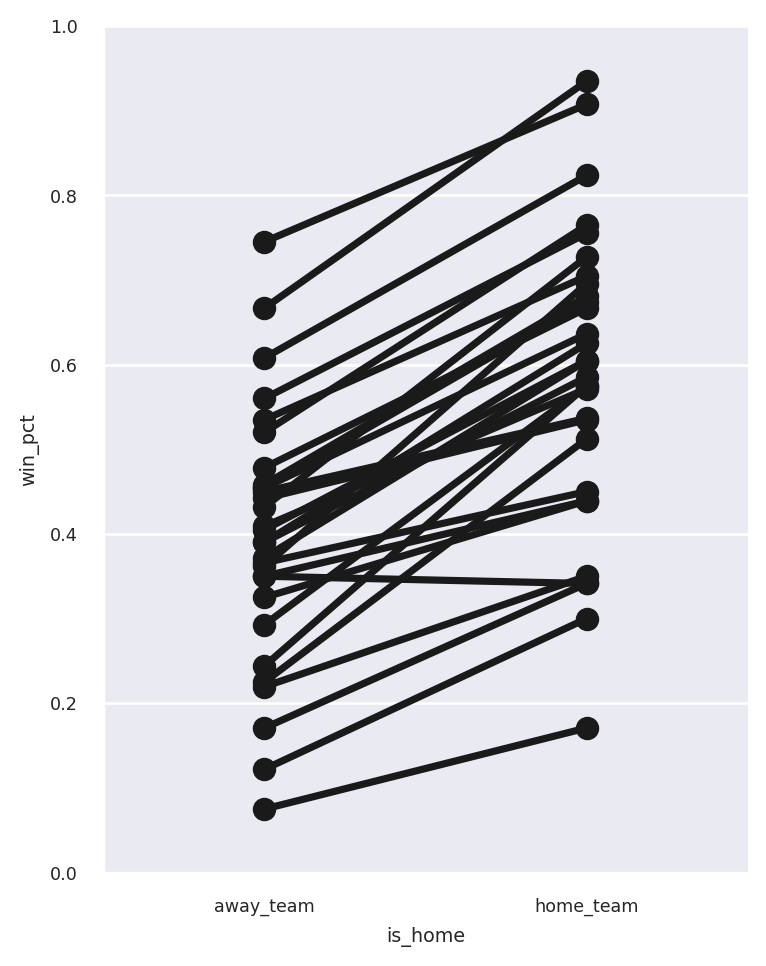
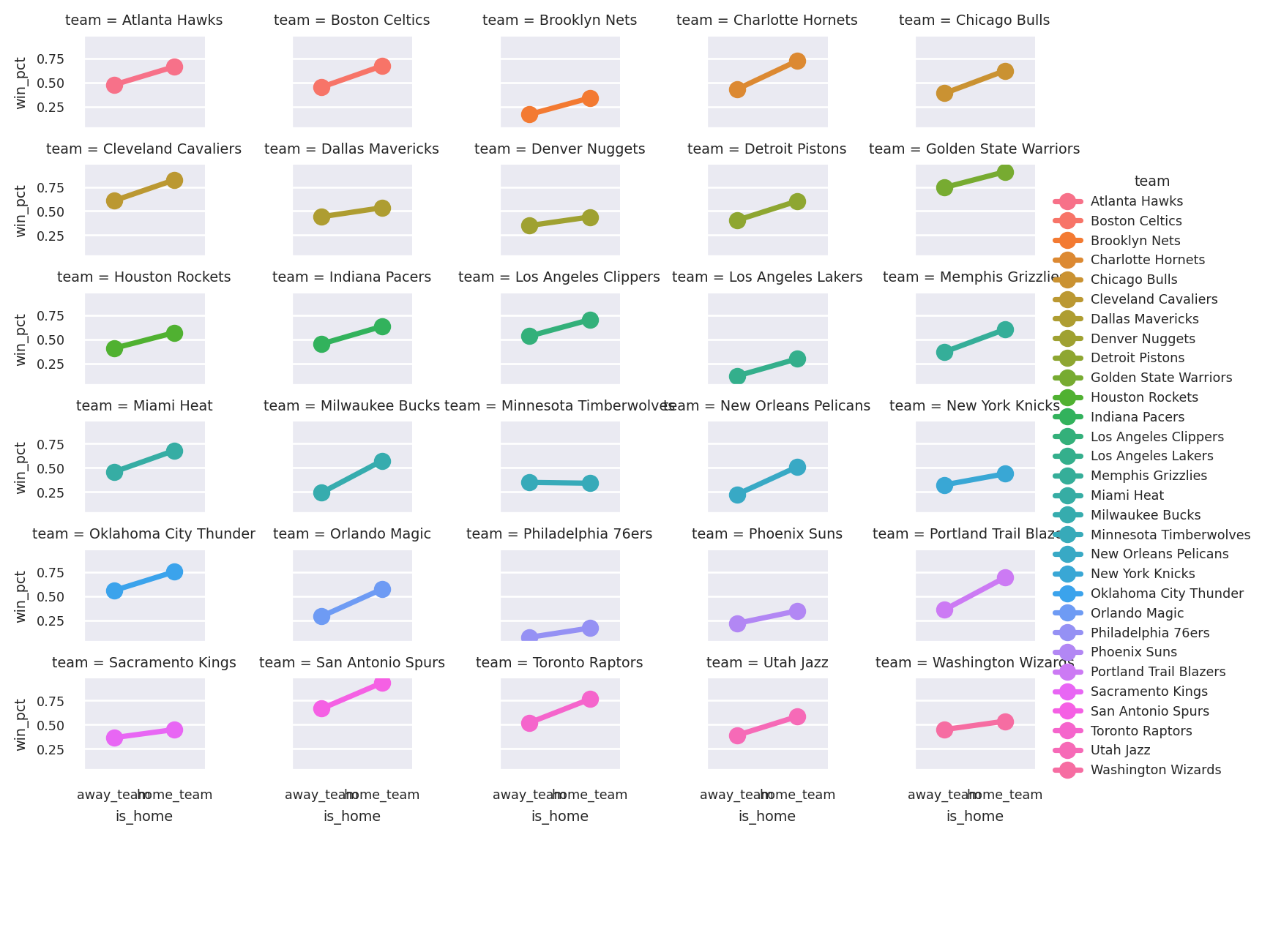
Now we use .pivot
so that this days-of-rest data can be added back to the original dataframe. We’ll also add columns for the spread between the home team’s rest and away team’s rest, and a flag for whether the home team won.
by_game_pl = (
tidy_pl
.pivot(
values= "rest" ,
index= ["game_id" , "date" ],
columns= "variable"
)
.rename({"away_team" : "away_rest" , "home_team" : "home_rest" })
)
joined_pl = (
by_game_pl
.join(games_pl.collect(), on= ["game_id" , "date" ])
.with_columns([
pl.col("home_points" ).alias("home_win" ) > pl.col("away_points" ),
pl.col("home_rest" ).alias("rest_spread" ) - pl.col("away_rest" ),
])
)
joined_pl
shape: (1_303, 10) game_id date away_rest home_rest away_team away_points home_team home_points home_win rest_spread u32 date i8 i8 str i64 str i64 bool i8 5 2015-10-28 0 null "Chicago Bulls" 115 "Brooklyn Nets" 100 false null 6 2015-10-28 null 0 "Utah Jazz" 87 "Detroit Piston… 92 true null … … … … … … … … … … 1314 2016-06-16 2 2 "Golden State W… 101 "Cleveland Cava… 115 true 0 1315 2016-06-19 2 2 "Cleveland Cava… 93 "Golden State W… 89 false 0
by_game_pd = (
tidy_pd
.pivot(
values= "rest" ,
index= ["game_id" , "date" ],
columns= "variable"
)
.rename(
columns= {"away_team" : "away_rest" , "home_team" : "home_rest" }
)
)
joined_pd = by_game_pd.join(games_pd).assign(
home_win= lambda df: df["home_points" ] > df["away_points" ],
rest_spread= lambda df: df["home_rest" ] - df["away_rest" ],
)
joined_pd
away_rest
home_rest
away_team
away_points
home_team
home_points
home_win
rest_spread
game_id
date
7
2015-10-28
0
<NA>
New Orleans Pelicans
94
Portland Trail Blazers
112
True
<NA>
11
2015-10-28
0
<NA>
Chicago Bulls
115
Brooklyn Nets
100
False
<NA>
...
...
...
...
...
...
...
...
...
...
1314
2016-06-16
2
2
Golden State Warriors
101
Cleveland Cavaliers
115
True
0
1315
2016-06-19
2
2
Cleveland Cavaliers
93
Golden State Warriors
89
False
0
1303 rows Ă— 8 columns
Here’s a lightly edited quote from Modern Pandas :
One somewhat subtle point: an “observation” depends on the question being asked. So really, we have two tidy datasets, tidy
for answering team-level questions, and joined
for answering game-level questions.
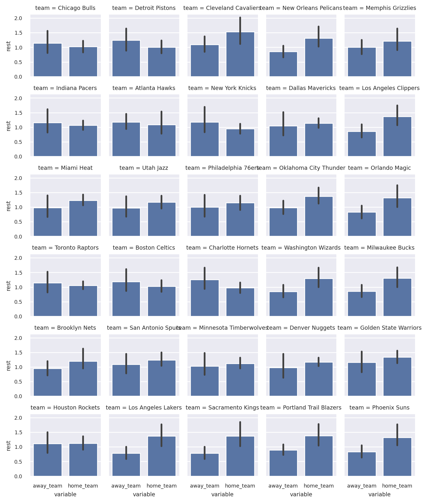
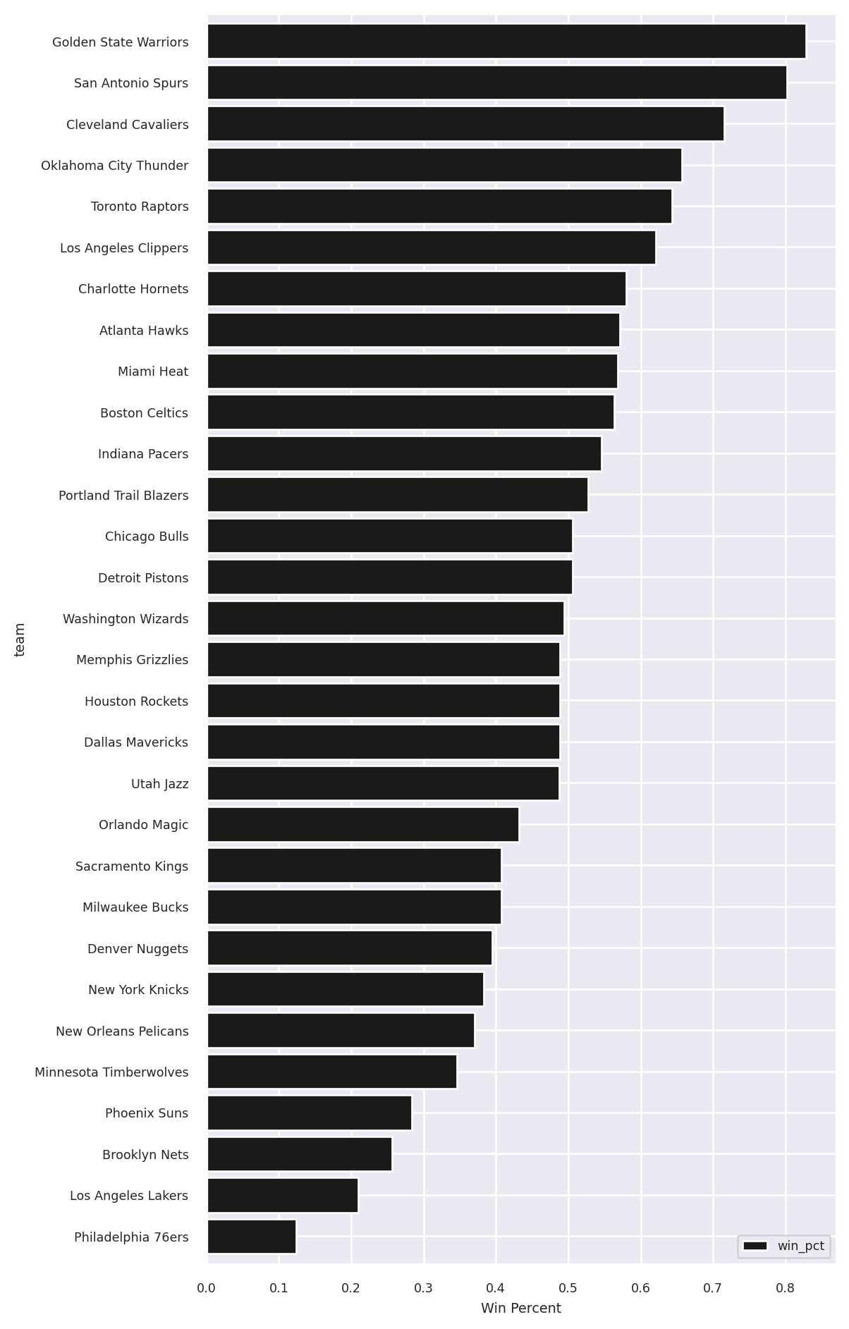
Let’s use the team-level dataframe to see each team’s average days of rest, both at home and away:
import seaborn as sns
sns.set_theme(font_scale= 0.6 )
sns.catplot(
tidy_pl,
x= "variable" ,
y= "rest" ,
col= "team" ,
col_wrap= 5 ,
kind= "bar" ,
height= 1.5 ,
)
<seaborn.axisgrid.FacetGrid at 0x7fd14ed3fd90>
Plotting the distribution of rest_spread
:
import numpy as np
delta_pl = joined_pl["rest_spread" ]
ax = (
delta_pl
.value_counts()
.drop_nulls()
.to_pandas()
.set_index("rest_spread" )
["counts" ]
.reindex(np.arange(delta_pl.min (), delta_pl.max () + 1 ), fill_value= 0 )
.sort_index()
.plot(kind= "bar" , color= "k" , width= 0.9 , rot= 0 , figsize= (9 , 6 ))
)
ax.set (xlabel= "Difference in Rest (Home - Away)" , ylabel= "Games" )
[Text(0.5, 0, 'Difference in Rest (Home - Away)'), Text(0, 0.5, 'Games')]
delta_pd = joined_pd["rest_spread" ]
ax = (
delta_pd
.value_counts()
.reindex(np.arange(delta_pd.min (), delta_pd.max () + 1 ), fill_value= 0 )
.sort_index()
.plot(kind= "bar" , color= "k" , width= 0.9 , rot= 0 , figsize= (9 , 6 ))
)
ax.set (xlabel= "Difference in Rest (Home - Away)" , ylabel= "Games" )
[Text(0.5, 0, 'Difference in Rest (Home - Away)'), Text(0, 0.5, 'Games')]
Plotting the win percent by rest_spread:
import matplotlib.pyplot as plt
fig, ax = plt.subplots(figsize= (9 , 6 ))
sns.barplot(
x= "rest_spread" ,
y= "home_win" ,
data= joined_pl.filter (pl.col("rest_spread" ).is_between(- 3 , 3 , closed= "both" )),
color= "#4c72b0" ,
ax= ax,
)
<Axes: xlabel='rest_spread', ylabel='home_win'>
fig, ax = plt.subplots(figsize= (9 , 6 ))
sns.barplot(
x= "rest_spread" ,
y= "home_win" ,
data= joined_pd.query('-3 <= rest_spread <= 3' ),
color= "#4c72b0" ,
ax= ax,
)
<Axes: xlabel='rest_spread', ylabel='home_win'>
Stack / Unstack vs Melt / Pivot
Pandas has special methods stack
and unstack
for reshaping data with a MultiIndex. Polars doesn’t have an index, so anywhere you see stack
/ unstack
in Pandas, the equivalent Polars code will use melt
/ pivot
.
rest_pl = (
tidy_pl
.group_by(["date" , "variable" ], maintain_order= True )
.agg(pl.col("rest" ).mean())
)
rest_pl
shape: (418, 3) date variable rest date str f64 2015-10-28 "away_team" 0.0 2015-10-28 "home_team" 0.0 … … … 2016-06-19 "away_team" 2.0 2016-06-19 "home_team" 2.0
rest_pd = (
tidy_pd
.groupby(["date" , "variable" ])
["rest" ]
.mean()
)
rest_pd
date variable
2015-10-28 away_team 0.0
home_team 0.0
...
2016-06-19 away_team 2.0
home_team 2.0
Name: rest, Length: 418, dtype: Float64
In Polars we use .pivot
to do what in Pandas would require .unstack
:
rest_pl.pivot(index= "date" , columns= "variable" , values= "rest" )
shape: (209, 3) date away_team home_team date f64 f64 2015-10-28 0.0 0.0 2015-10-29 0.333333 0.0 … … … 2016-06-16 2.0 2.0 2016-06-19 2.0 2.0
variable
away_team
home_team
date
2015-10-28
0.0
0.0
2015-10-29
0.333333
0.0
...
...
...
2016-06-16
2.0
2.0
2016-06-19
2.0
2.0
209 rows Ă— 2 columns
Plotting the moving average of rest days:
ax = (
rest_pl.pivot(index= "date" , values= "rest" , columns= "variable" )
.filter (pl.col("away_team" ) < 7 )
.sort("date" )
.select([pl.col("date" ), pl.col(pl.Float64).rolling_mean(7 )])
.to_pandas()
.set_index("date" )
.plot(figsize= (9 , 6 ), linewidth= 3 )
)
ax.set (ylabel= "Rest (7 day MA)" )
[Text(0, 0.5, 'Rest (7 day MA)')]
ax = (
rest_pd.unstack()
.query('away_team < 7' )
.sort_index()
.rolling(7 )
.mean()
.plot(figsize= (9 , 6 ), linewidth= 3 )
)
ax.set (ylabel= "Rest (7 day MA)" )
[Text(0, 0.5, 'Rest (7 day MA)')]
Mini Project: Home Court Advantage?
We may as well do some (not very rigorous) analysis: let’s see if home advantage is a real thing.
Find the win percent for each team
We want to control for the strength of the teams playing. The team’s victory percentage is probably not a good control but it’s what we’ll use:
win_col = pl.col("win" )
wins_pl = (
joined_pl.melt(
id_vars= ["game_id" , "date" , "home_win" ],
value_name= "team" ,
variable_name= "is_home" ,
value_vars= ["home_team" , "away_team" ],
)
.with_columns(pl.col("home_win" ).alias("win" ) == (pl.col("is_home" ) == "home_team" ))
.group_by(["team" , "is_home" ])
.agg(
[
win_col.sum ().alias("n_wins" ),
win_col.count().alias("n_games" ),
win_col.mean().alias("win_pct" ),
]
)
.sort(["team" , "is_home" ])
)
wins_pl
shape: (60, 5) team is_home n_wins n_games win_pct str str u32 u32 f64 "Atlanta Hawks" "away_team" 22 46 0.478261 "Atlanta Hawks" "home_team" 30 45 0.666667 … … … … … "Washington Wiz… "away_team" 18 40 0.45 "Washington Wiz… "home_team" 22 41 0.536585
wins_pd = (
joined_pd
.reset_index()
.melt(
id_vars= ["game_id" , "date" , "home_win" ],
value_name= "team" ,
var_name= "is_home" ,
value_vars= ["home_team" , "away_team" ],
)
.assign(win= lambda df: df["home_win" ] == (df["is_home" ] == "home_team" ))
.groupby(["team" , "is_home" ])["win" ]
.agg(['sum' , 'count' , 'mean' ])
.rename(columns= {
"sum" : 'n_wins' ,
"count" : 'n_games' ,
"mean" : 'win_pct'
})
)
wins_pd
n_wins
n_games
win_pct
team
is_home
Atlanta Hawks
away_team
22
46
0.478261
home_team
30
45
0.666667
...
...
...
...
...
Washington Wizards
away_team
18
40
0.450000
home_team
22
41
0.536585
60 rows Ă— 3 columns
Some visualisations
g = sns.FacetGrid(wins_pl, hue= "team" , aspect= 0.8 , palette= ["k" ], height= 5 )
g.map (
sns.pointplot,
"is_home" ,
"win_pct" ,
order= ["away_team" , "home_team" ]).set (ylim= (0 , 1 ))
<seaborn.axisgrid.FacetGrid at 0x7fd136348790>
sns.catplot(
wins_pl,
x= "is_home" ,
y= "win_pct" ,
col= "team" ,
col_wrap= 5 ,
hue= "team" ,
kind= "point" ,
height= 1.5 ,
)
<seaborn.axisgrid.FacetGrid at 0x7fd136126490>
Now we calculate the win percent by team, regardless of whether they’re home or away:
win_percent_pl = (
wins_pl.group_by("team" , maintain_order= True ).agg(
pl.col("n_wins" ).sum ().alias("win_pct" ) / pl.col("n_games" ).sum ()
)
)
win_percent_pl
shape: (30, 2) team win_pct str f64 "Atlanta Hawks" 0.571429 "Boston Celtics… 0.563218 … … "Utah Jazz" 0.487805 "Washington Wiz… 0.493827
win_percent_pd = (
wins_pd
.groupby(level= "team" , as_index= True )
.apply (lambda x: x["n_wins" ].sum () / x["n_games" ].sum ())
)
win_percent_pd
team
Atlanta Hawks 0.571429
Boston Celtics 0.563218
...
Utah Jazz 0.487805
Washington Wizards 0.493827
Length: 30, dtype: float64
(
win_percent_pl
.sort("win_pct" )
.to_pandas()
.set_index("team" )
.plot.barh(figsize= (6 , 12 ), width= 0.85 , color= "k" )
)
plt.xlabel("Win Percent" )
Text(0.5, 0, 'Win Percent')
Here’s a plot of team home court advantage against team overall win percentage:
wins_to_plot_pl = (
wins_pl.pivot(index= "team" , columns= "is_home" , values= "win_pct" )
.with_columns(
[
pl.col("home_team" ).alias("Home Win % - Away %" ) - pl.col("away_team" ),
(pl.col("home_team" ).alias("Overall %" ) + pl.col("away_team" )) / 2 ,
]
)
)
sns.regplot(data= wins_to_plot_pl, x= 'Overall %' , y= 'Home Win % - Away %' )
wins_to_plot_pd = (
wins_pd
["win_pct" ]
.unstack()
.assign(** {'Home Win % - Away %' : lambda x: x["home_team" ] - x["away_team" ],
'Overall %' : lambda x: (x["home_team" ] + x["away_team" ]) / 2 })
)
sns.regplot(data= wins_to_plot_pd, x= 'Overall %' , y= 'Home Win % - Away %' )
<Axes: xlabel='Overall %', ylabel='Home Win % - Away %'>
Let’s add the win percent back to the dataframe and run a regression:
reg_df_pl = (
joined_pl.join(win_percent_pl, left_on= "home_team" , right_on= "team" )
.rename({"win_pct" : "home_strength" })
.join(win_percent_pl, left_on= "away_team" , right_on= "team" )
.rename({"win_pct" : "away_strength" })
.with_columns(
[
pl.col("home_points" ).alias("point_diff" ) - pl.col("away_points" ),
pl.col("home_rest" ).alias("rest_diff" ) - pl.col("away_rest" ),
pl.col("home_win" ).cast(pl.UInt8), # for statsmodels
]
)
)
reg_df_pl.head()
shape: (5, 14) game_id date away_rest home_rest away_team away_points home_team home_points home_win rest_spread home_strength away_strength point_diff rest_diff u32 date i8 i8 str i64 str i64 u8 i8 f64 f64 i64 i8 5 2015-10-28 0 null "Chicago Bulls" 115 "Brooklyn Nets" 100 0 null 0.256098 0.506173 -15 null 6 2015-10-28 null 0 "Utah Jazz" 87 "Detroit Piston… 92 1 null 0.505882 0.487805 5 null 11 2015-10-28 0 null "Cleveland Cava… 106 "Memphis Grizzl… 76 0 null 0.488372 0.715686 -30 null 14 2015-10-28 0 null "New Orleans Pe… 94 "Portland Trail… 112 1 null 0.526882 0.37037 18 null 17 2015-10-29 0 0 "Memphis Grizzl… 112 "Indiana Pacers… 103 0 0 0.545455 0.488372 -9 0
reg_df_pd = (
joined_pd.assign(
away_strength= joined_pd['away_team' ].map (win_percent_pd),
home_strength= joined_pd['home_team' ].map (win_percent_pd),
point_diff= joined_pd['home_points' ] - joined_pd['away_points' ],
rest_diff= joined_pd['home_rest' ] - joined_pd['away_rest' ])
)
reg_df_pd.head()
away_rest
home_rest
away_team
away_points
home_team
home_points
home_win
rest_spread
away_strength
home_strength
point_diff
rest_diff
game_id
date
7
2015-10-28
0
<NA>
New Orleans Pelicans
94
Portland Trail Blazers
112
True
<NA>
0.370370
0.526882
18
<NA>
11
2015-10-28
0
<NA>
Chicago Bulls
115
Brooklyn Nets
100
False
<NA>
0.506173
0.256098
-15
<NA>
15
2015-10-28
<NA>
0
Utah Jazz
87
Detroit Pistons
92
True
<NA>
0.487805
0.505882
5
<NA>
16
2015-10-28
0
<NA>
Cleveland Cavaliers
106
Memphis Grizzlies
76
False
<NA>
0.715686
0.488372
-30
<NA>
17
2015-10-29
1
0
Atlanta Hawks
112
New York Knicks
101
False
-1
0.571429
0.382716
-11
-1
import statsmodels.formula.api as sm
mod = sm.logit(
"home_win ~ home_strength + away_strength + home_rest + away_rest" ,
reg_df_pl.to_pandas(),
)
res = mod.fit()
res.summary()
Optimization terminated successfully.
Current function value: 0.554797
Iterations 6
Logit Regression Results
Dep. Variable: home_win No. Observations: 1299
Model: Logit Df Residuals: 1294
Method: MLE Df Model: 4
Date: Fri, 03 Nov 2023 Pseudo R-squ.: 0.1777
Time: 01:52:21 Log-Likelihood: -720.68
converged: True LL-Null: -876.38
Covariance Type: nonrobust LLR p-value: 3.748e-66
coef std err z P>|z| [0.025 0.975]
Intercept -0.0019 0.304 -0.006 0.995 -0.597 0.593
home_strength 5.7161 0.466 12.272 0.000 4.803 6.629
away_strength -4.9133 0.456 -10.786 0.000 -5.806 -4.020
home_rest 0.1045 0.076 1.381 0.167 -0.044 0.253
away_rest -0.0347 0.066 -0.526 0.599 -0.164 0.095
You can play around with the regressions yourself but we’ll end them here.
Summary
This was mostly a demonstration of .pivot
and .melt
, with several different examples of reshaping data in Polars and Pandas.